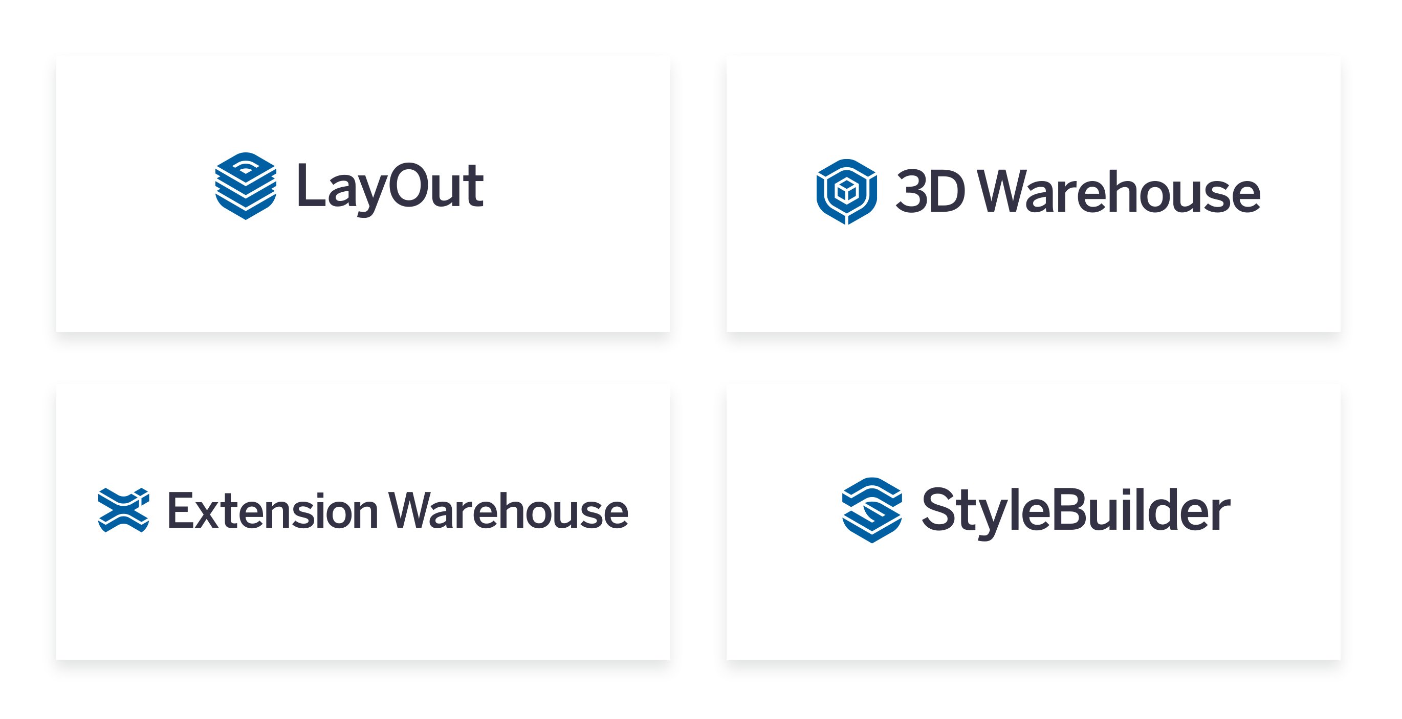
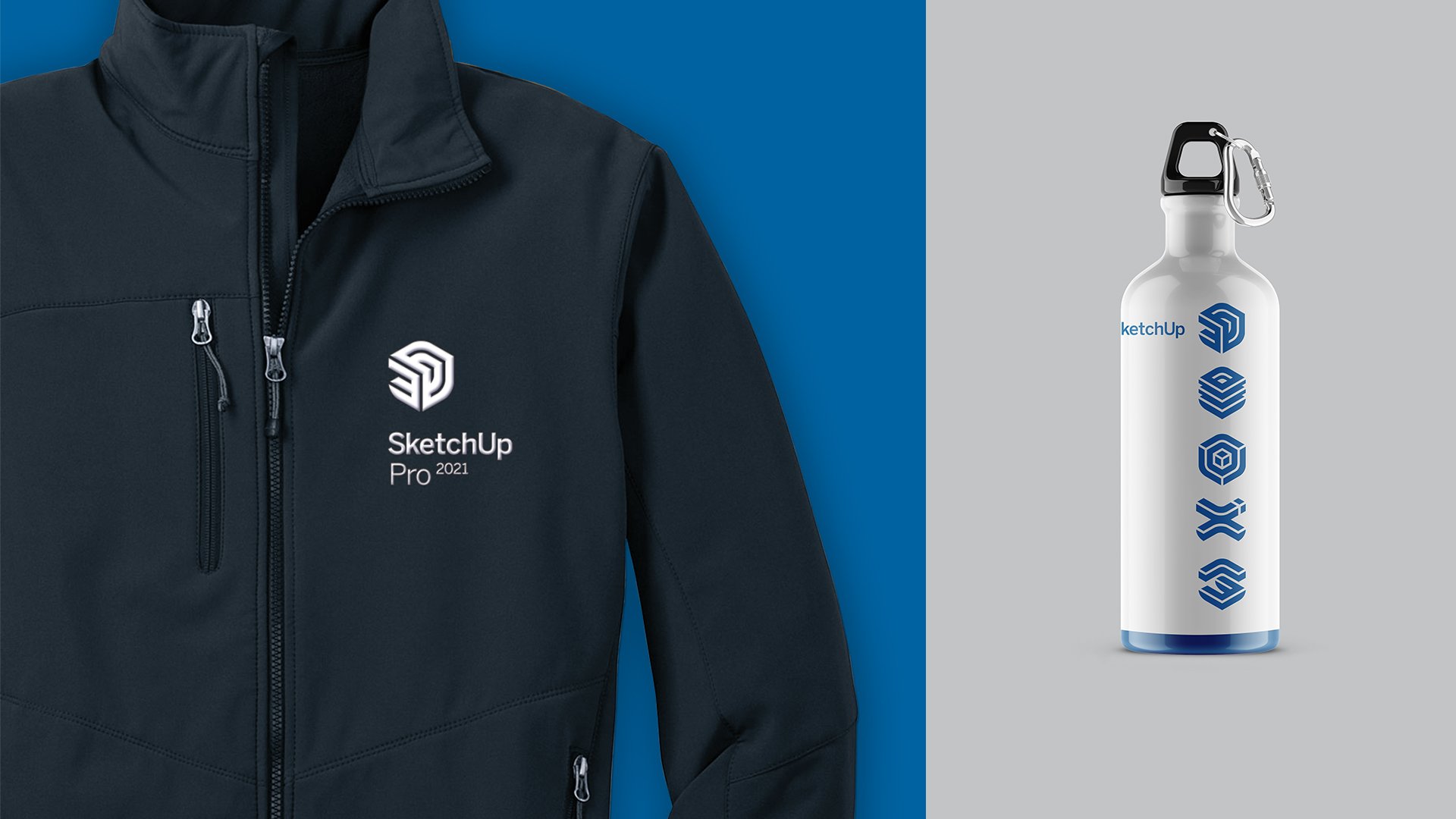
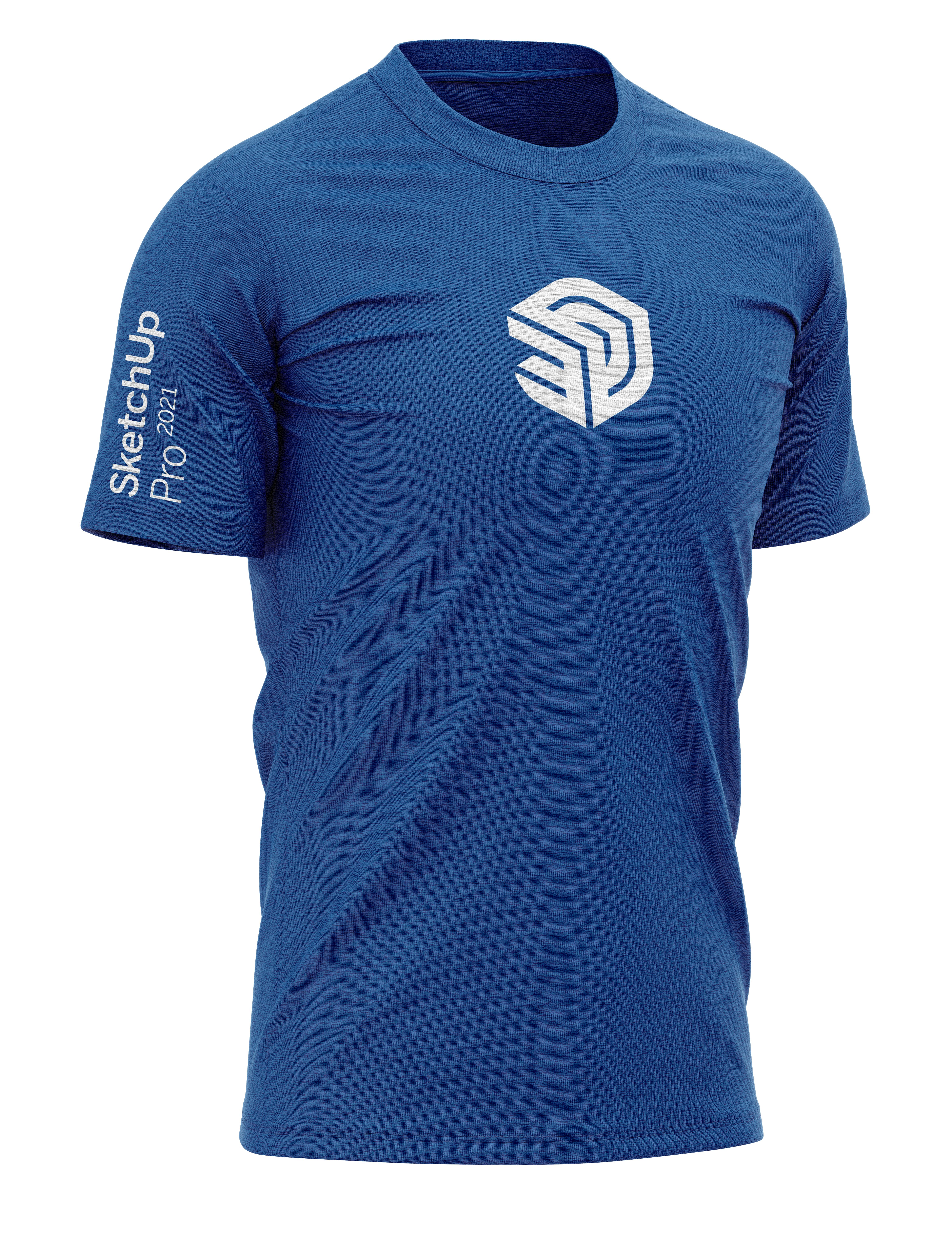
As one of the premier products in the Trimble family, SketchUp needed a new look that would welcome it into the Trimble family. We partnered with Trimble to help update and refresh the SketchUp family of logos while preserving the integrity of the entire Trimble platform of products.
The new suite of SketchUp logos needed to thoughtfully build upon the core values of the SketchUp product, while working within the guidelines of the Trimble family of logos and broader design system.

To say the SketchUp rebrand was a challenging graphic puzzle would be an understatement. But creating a family of unique, dynamic 2-D logos that also exist accurately in 3-D was an amazing and rewarding experience.
The main challenge of this redesign was to create a set of multiple icons that shared certain crucial characteristics but would at the same time stand alone as unique and compelling marks. Each icon in the product family needed to exist on the same isometric grid, they needed to share the same balance of positive and negative space, and most importantly, they needed to be accurately and precisely recreated in 3D within SketchUp (a trait that the old identity didn’t have).